Fresh Styles getting a bit stale? Try new & improved freshER styles! >>

 • buy the book -->
• read some reviews: A * B * C * D
• read some chapters: HTMinimaLism [part1 | part2] * lo-fi grunge * gothic organic
I. INTRODUCTION
Problem: The look and feel of most U.S. corporate sites is very similar due to inbreeding. If they do it at Microsoft.com, that must be what a professional corporate site is supposed to look like, and then all sites look like Microsoft's site (or Amazon, or Ebay, or...)
Solution: Look elsewhere for design inspiration. Introduce some new web design ideas into the mix -- new blood for the design gene pool.
Where to look for fresh design ideas:
Experimental Home Pages/ Non-Print-Based Design firms: To them the web is not new media, it's THE media. They aren't looking to magazines for inspiration. They're looking to medical diagrams, early-80's software interfaces, grocery bags, cartoons, and the browser window itself.
II. TEN FRESH STYLES [8/2001]
 A. HTMinimaLism School:
- source inspiration: html code, Jakob Neilsen's brain
- techniques: simple, not ugly. CSS Font Control. a little color goes a long way. negative space. HTML text as design element. liquid layout.
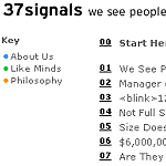
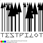
- home page/ design firm examples: 37signals manifesto, test pilot collective, coudal partners, a list apart, type different
- commercial example: opsound
 B. Mondrian Poster School:
- source inspiration: Piet Mondrian / TV Test Pattern Color Bars
- techniques: color blocks without borders. holistic browser window design and negative space. navigation integrated into overall page design. intentional color palette.
- commercial examples: vitra design museum (original splash | original site 1 | original site 2)
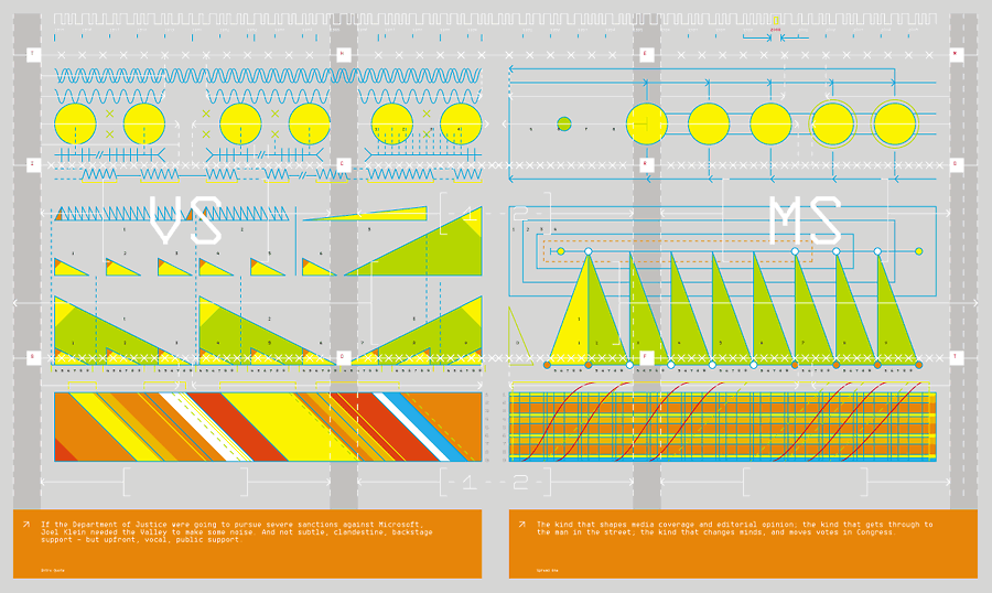
 C. Grid-Based Icon School:
- source inspiration: Edward Tufte, Mies Van Der Rohe, Josef Müller-Brockmann, architectural blueprints, retro-electronic interfaces
- techniques: Geometric Shapes at 45-Degree-Angle Increments, Melding Photography with Grid-Based Layouts, Using Chartjunk as Design
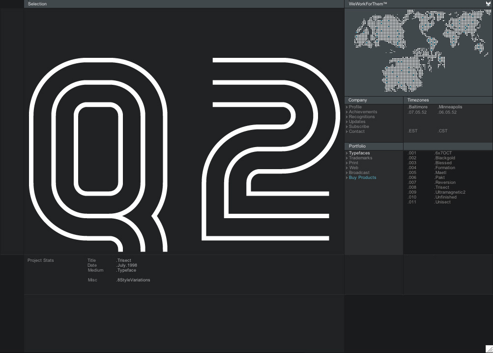
- home page/ design firm example: Prototype 19, weworkforthem (original interface, screenshot), mike cina ( 1 | 2 )
 D. SuperTiny SimCity School:
- source inspiration: Sim City, Commodore 64 computer games, Japanese candy wrappers
- techniques: Tiny Pixelated People, Buildings, and Objects; Pixelated Fonts; Extreme Compartmentalization
- home page/ design firm examples: kaliber 10000, flipflopflyin, db-db
- commercial example: bento cafe
 E. Lo-Fi Grunge School:
- source inspiration: David Carson, Raygun Magazine, non-digital printing, smudges, blurs, interference
- techniques: Background/Foreground Gif Pairing, Scanlines, Brushes for Smudges, Dots and Dashes for Borders
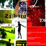
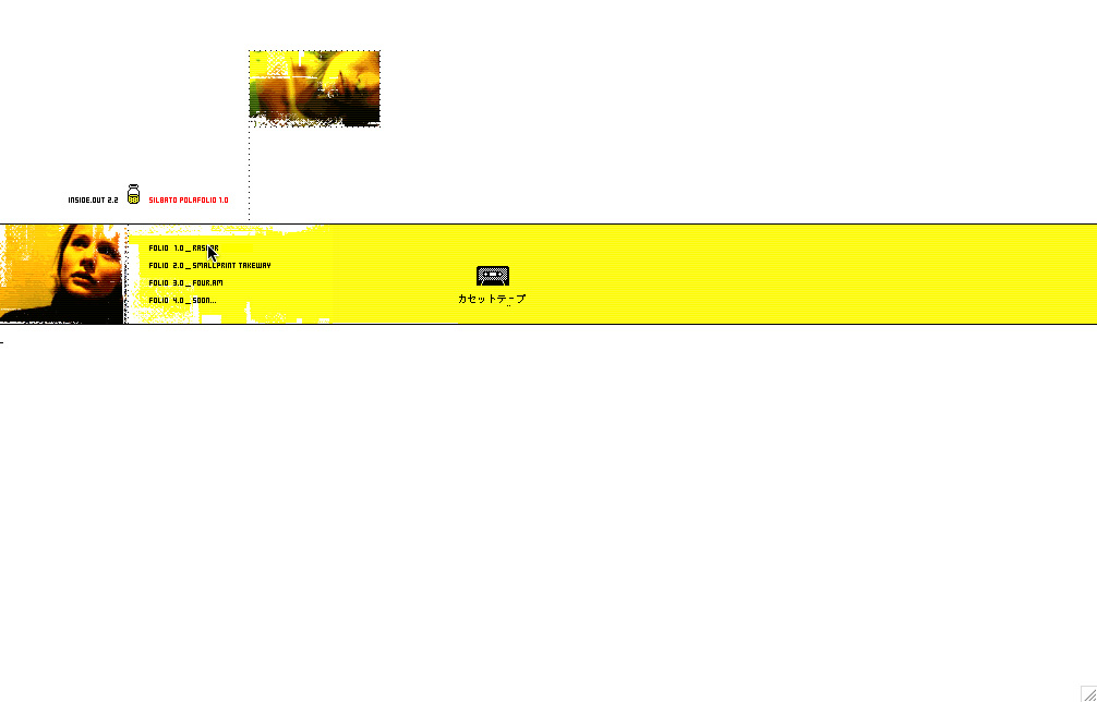
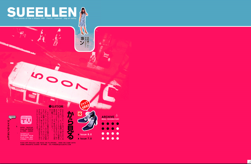
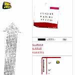
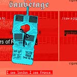
- home page/ design firm example: silbato (screen shot), sueellen (screenshot)
- commercial example: Nokian Tyres (screen shot)
 F. Paper Bag School:
- source inspiration: turn-of-the-century (1900) cartoons, paper bags
- techniques: Paper Bag Textures, Intentional Misalignment and Sloppy Boundaries, Judicious Color Usage (mostly duotone, color for emphasis), Nomadic Navigation Bar, Hand Lettering
- home page/ design firm examples: Funny Garbage
 G. Gothic Organic School:
- source inspiration: human body, organic real-world textures, Vaughan Oliver
- techniques: Analogesque Background Textures, Foreground Images with Irregular Borders, Transparent Animated Gifs, Intentional Exploitation of Vertical Scrolling
- home page/ design firm example: Entropy8Zuper
- commercial examples: new icon-school of denmark
 H. Pixelated Punk Rock School:
- source inspiration: chaos, irregular machine behavior, programming code, George Seraut, dadaism, punk
- techniques: Fake Malfunction; Rigged Navigation; Missing or Misleading Signposts; Perpetual Motion and Noise; Unorthodox Image Cropping, Enlargement, and Subject Matter; Rogue Multimedia; Big Old Ugly HTML Text
- home page/ design firm examples: , dream7
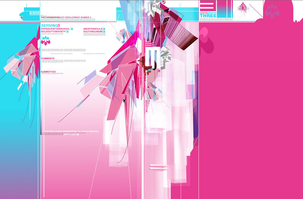
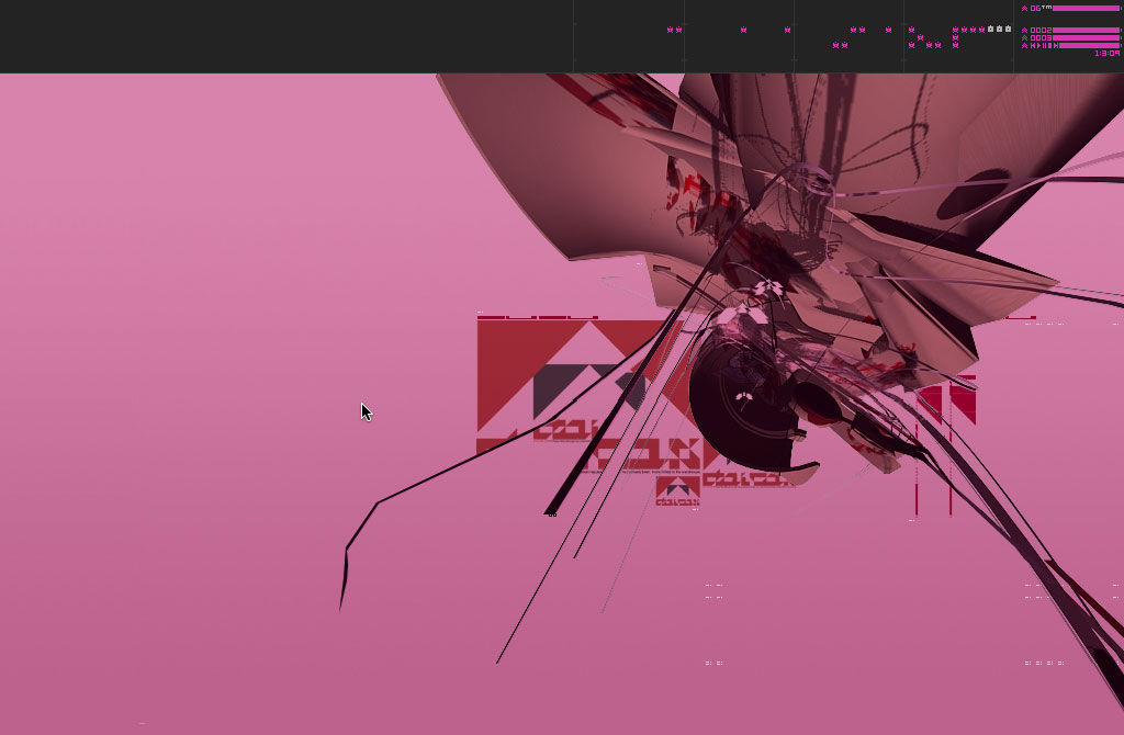
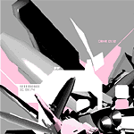 I. Drafting Table/ Transformer School:
- source inspiration: Zaha Hadid's architectural blueprints, technical manuals, 3D graffiti, transformer robot toys, bar codes, graph paper, fine print disclaimers
- techniques: 3D Modeling Software, Tiny Illegible Type, Single Bold Design in Semi-Negative Space, Spatial Navigation
- home page/ design firm examples: designgraphik (screenshot of version 3, screenshot of version 5)
 J. 1950s Hello Kitty School:
- source inspiration: cute girl comics/ woodmation chirstmas specials/ 1950s' campers
- techniques: Tiny 3D Bubble People; Large 3D Text; Rounded, Organic Borders; Pastel Palettes; '50s Fonts/'50s Art
- home page/ design firm examples: Future Farmers (one world), Atlas Magazine
III. BONUS STYLE
 K. 1970s Dayglow Outline School:
- source inspiration: mid-70s Scott Baio spraypainted sunset t-shirts
- techniques: Illustrator reductionism, flash vector animation, bright colors, campiness
- home page/ design firm examples: rinzen, upso
IV. CONCLUSION
These styles are not cut and dry. Use them to greater or leser degrees; mix them; create your own styles. Each project will dictate its own direction. I just mean to add some extra tools to your web design toolbox.
It's useful to note that you create the context of your site. If your site works in and of itself, it will fly regardless of how it fits in with other sites. It doesn't have to match the rest of the corporate web, it just has to match itself.
Some take-aways: Avoid sterility. The best solution might not always be the standard solution. And finally, contrary to popular belief, beauty enhances usability.
Curt Cloninger
home | garden | archive
updated: 8.25.14